Introduction
Backdrops provide a simple way to place a translucent image behind contextual content. Backdrops offer two style variants: Image Proportional and Fixed Height.
Backdrops remove the need for using CSS background images. Feature images exist within the HTML, so screen readers can read the text of the image's alt attribute.
Video backdrops respect users' reduced motion settings. This ensures a smoother, more comfortable experience for those who have opted for less motion on their devices..
Image Proportional
Image-proportional backdrops adjust automatically to different screen sizes. Below is an example of a basic Image Proportional backdrop.
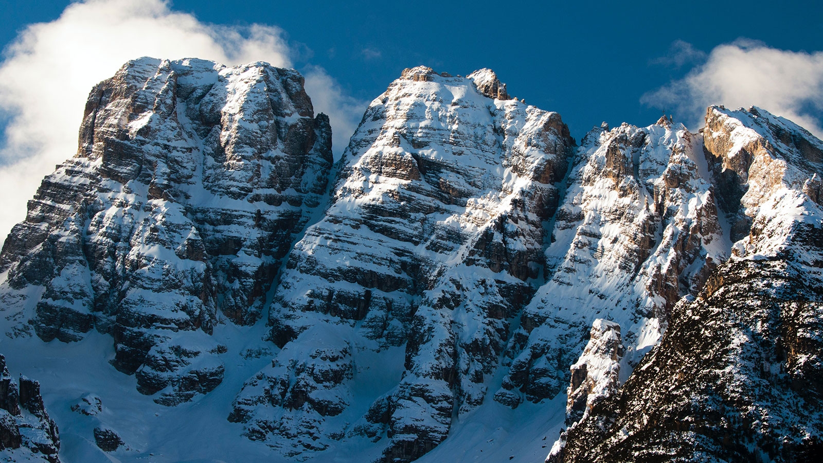
Photo by Zdeněk Macháček
In Their Eternal Faces
The Sun—with just delight
        <div class="backdrop theme-dark">

            <div class="backdrop__media">

            <img class="opacity-50" src="https://via.placeholder.com/1500x750" alt="Placeholder" />

                <div class="backdrop__media__credit">
                    <p>Photo by <a href="#1">Jane Doe</a> on Unsplash</p>
                </div>

            </div>

            <div class="backdrop__cover">

                <div class="container text-align-center">
                    <p class="h4 text-shadow margin-bottom-3">
                        <em>In Their Eternal Faces<br>The Sun—with just delight</em>
                    </p>
                    <a class="button font-size-md theme-primary" href="#1">
                        Emily Dickenson Poetry
                    </a>
                </div>

            </div>

        </div>
| Line # | Details |
|---|---|
| 1 | The parent The |
| 3-11 | The The |
| 13-24 | The |
The size of this backdrop (proportional width and height) is determined by the size of its feature image.
The translucent effect of the backdrop is achieved with additional utility classes. Our theme color utilities (e.g., .theme-dark) set the background and text color. The opacity utility class (e.g., .opacity-30) applied to the backdrop's feature image allows the background color to show through.
Stack Breakpoint Modifiers
When using image size proportional backdrops for featured content (like the full-width example below), the backdrop may become too tall for the image on smaller viewport sizes.
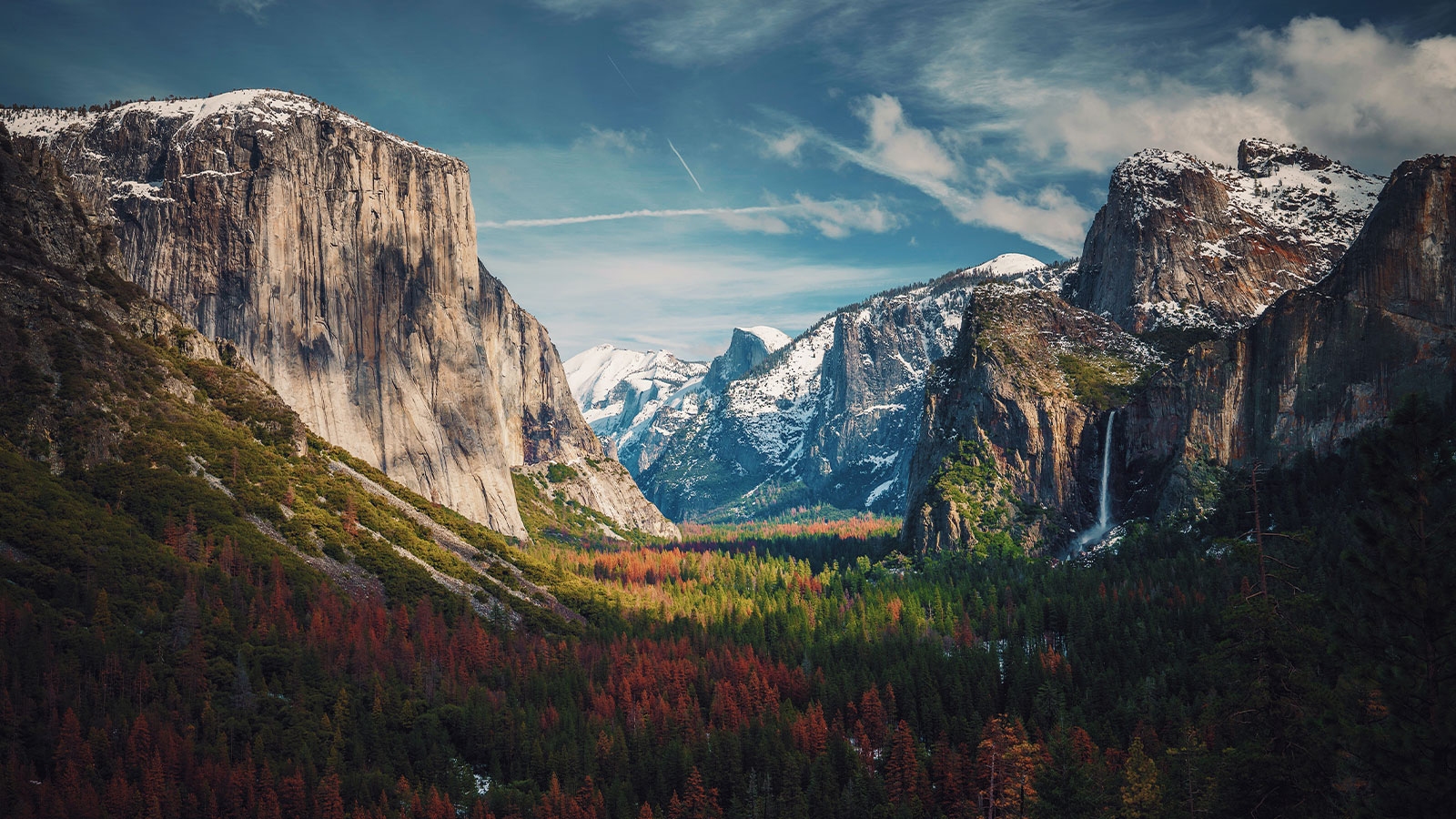
Photo by Aniket Deole
The mountain at a given distance In amber lies
—Excerpt from Delight becomes pictoral
To adjust for small screens, add a stack breakpoint modifier (e.g., .backdrop--stack--{x}) to the .backdrop class. Where x is the desired breakpoint (e.g., lg for large). The backdrop's image is placed above the content vertically until the viewport reaches the specified breakpoint.
Resize your browser window to see this in action. Notice the image is at full opacity because opacity utilities have their own breakpoint modifiers. Adding .opacity-40--lg to the .backdrop__media class gives that image a specified opacity (40%) at the large (lg) breakpoint.
Figure 2 below provides the code used to create the backdrop above. Refer specifically to line 1, where the .backdrop--stack--lg breakpoint modifier is present.
        <div class="backdrop backdrop--stack--lg theme-dark">

            <div class="backdrop__media">

                <img class="opacity-50" src="https://via.placeholder.com/1500x750" alt="Placeholder" />

                <div class="backdrop__media__credit">
                    <p>Photo by <a href="#1">Jane Doe</a> on Unsplash</p>
                </div>

            </div>

            <div class="backdrop__cover">

                <div class="container narrow margin-y-5">

                    <div class="text-shadow text-align-center margin-bottom-4">
                        <h1 class="banner-headline">
                            The mountain at a given distance<br>
                            In amber lies
                        </h1>
                        <p>—Excerpt from <em>Delight becomes pictorial</em></p>
                    </div>

                    <div class="grid grid--column-2--md gap-2">

                        <a class="button button--outline width-100" href="#1">
                            About Emily Dickenson
                        </a>

                        <a class="button theme-secondary width-100 box-shadow-1" href="#1">
                            Emily Dickenson Poetry
                        </a>

                    </div>

                </div>

            </div>

        </div>
All of this together makes it easy to create responsive backdrops with different themes and content. What if we don't want our backdrop's size to be dictated by its feature image?
Fixed Height
Fixed Height backdrops maintain their height across different viewport sizes. They adjust to the height of their inner content.
For a fixed height backdrop, add the .backdrop--fixed class to the .backdrop element.
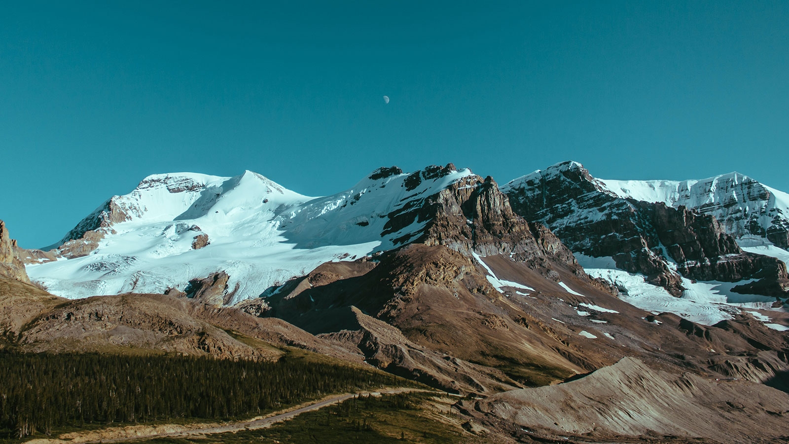
Photo by Jane Doe on Unsplash
The Mountain sat upon the Plain
The .backdrop--fixed class stretches to fit the content within .backdrop__cover. Consider the following layout:
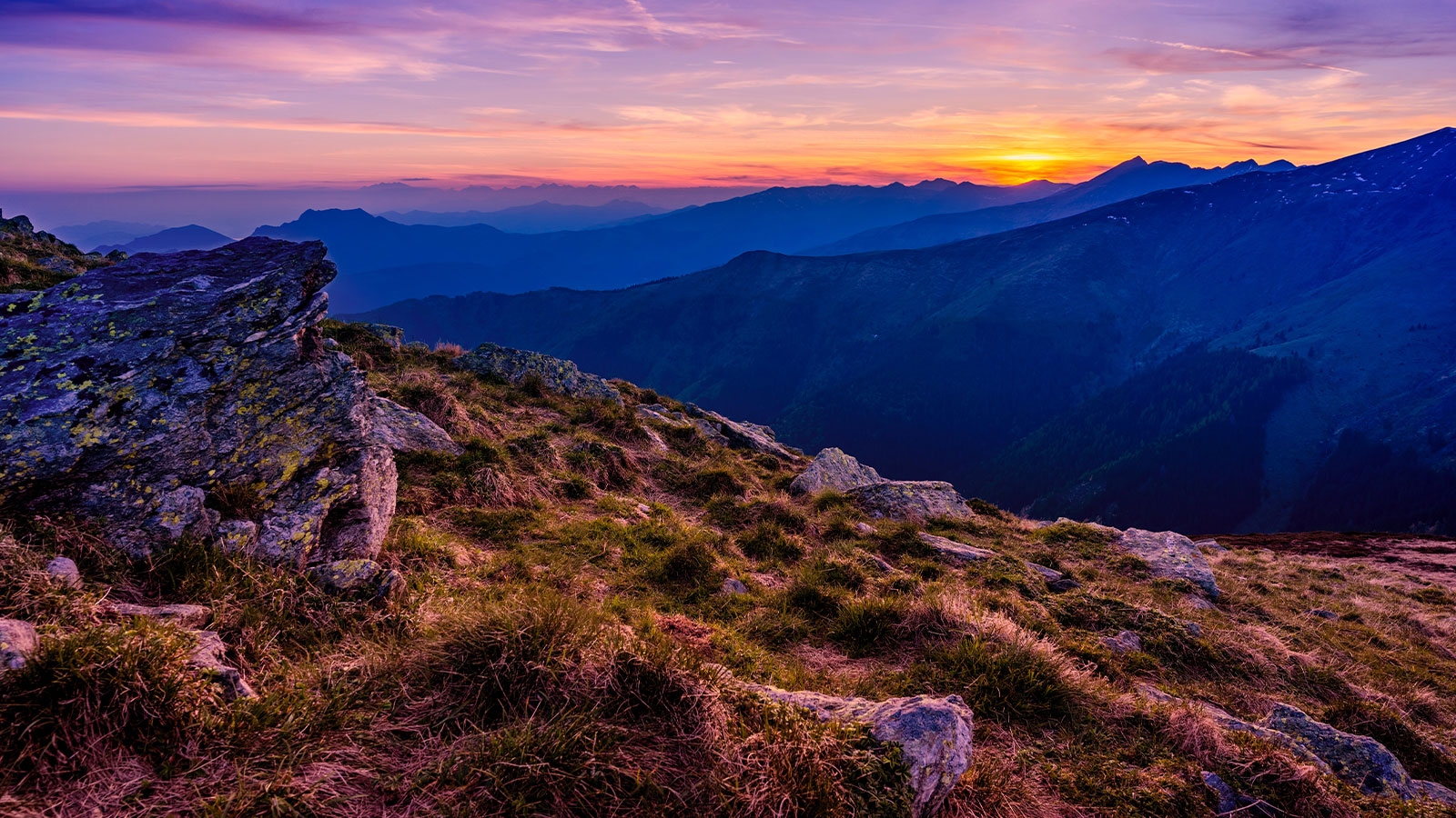
Photo by Alberto Restifo
Nature in Poetry
Featured Poem
This—is the land—the Sunset washes—
This—is the land—the Sunset washes—
These—are the Banks of the Yellow Sea—
Where it rose—or whither it rushes—
These—are the Western Mystery!
Night after Night
Her purple traffic
Strews the landing with Opal Bales—
Merchantmen—poise upon Horizons—
Dip—and vanish like Orioles!
About the Poet
Emily Dickenson
Emily Elizabeth Dickinson was an American poet. Little-known during her life, she has since been regarded as one of the most important figures in American poetry.
Dickinson was born in Amherst, Massachusetts into a prominent family with strong ties to its community.
        <div class="backdrop backdrop--fixed theme-dark">

            <div class="backdrop__media">

                <img class="opacity-50" src="https://via.placeholder.com/1500x750" alt="Placeholder" />

                <div class="backdrop__media__credit">
                    <p>Photo by <a href="#1">Jane Doe</a> on Unsplash</p>
                </div>

            </div>

            <div class="backdrop__cover">

                <div class="margin-y-5">

                    <div class="container narrow">
                        <h1 class="banner-headline text-align-center text-shadow margin-bottom-4">
                            <em>Nature in Poetry</em>
                        </h1>
                    </div>

                    <div class="container narrow medium--xl">

                        <div class="grid grid--column-2--xl gap-2 justify-content-center">

                            <div class="card border-radius-2 theme-light box-shadow-2">

                                <div class="card__head border-bottom">
                                    <p><em>Featured Poem</em></p>
                                </div>

                                <div class="card__body">
                                    <h2 class="h6">
                                        This—is the land—the Sunset washes—
                                    </h2>
                                    <p>
                                        <em>
                                            This—is the land—the Sunset washes—<br>
                                            These—are the Banks of the Yellow Sea—<br>
                                            Where it rose—or whither it rushes—<br>
                                            These—are the Western Mystery!
                                        </em>
                                    </p>
                                    <p>
                                        <em>
                                            Night after Night<br>
                                            Her purple traffic<br>
                                            Strews the landing with Opal Bales—<br>
                                            Merchantmen—poise upon Horizons—<br>
                                            Dip—and vanish like Orioles!
                                        </em>
                                    </p>
                                </div>

                                <div class="card__foot border-top">
                                    <a class="button button--has-icon--disperse theme-primary" href="#1">
                                        <span class="button__text">Emily Dickenson Poetry</span>
                                        <span class="icon icon-arrow-right button__icon"></span>
                                    </a>
                                </div>

                            </div>

                            <div class="card border-radius-2 theme-light box-shadow-2">

                                <div class="card__head border-bottom">
                                    <p><em>About the Poet</em></p>
                                </div>

                                <div class="card__body">
                                    <h2 class="h4">
                                        Emily Dickenson
                                    </h2>
                                    <p>
                                        Emily Elizabeth Dickinson was an American poet. Little-known during her life, she has since been regarded as one of the most important figures in American poetry.
                                    </p>
                                    <p>
                                        Dickinson was born in Amherst, Massachusetts into a prominent family with strong ties to its community.
                                    </p>
                                </div>

                                <div class="card__foot border-top">
                                    <a class="button button--has-icon--disperse theme-primary" href="#1">
                                        <span class="button__text">About Emily Dickenson</span>
                                        <span class="icon icon-arrow-right button__icon"></span>
                                    </a>
                                </div>

                            </div>

                        </div>

                    </div>

                </div>

            </div>

        </div>
Video Backdrop
The Backdrop component can also include a video as its feature media. By using the .backdrop__media class to contain a video element, you can create a dynamic and visually appealing backdrop that plays automatically when users access the page.
Below is an example of a Backdrop with a video as the feature media, including a media control button:
Faucibus scelerisque eleifend donec pretium vulputate
To ensure the video respects users' preferences regarding reduced motion, you can include an optional control element using the .backdrop__media__control selector. This control allows users to pause the video if they prefer to limit motion effects. The button inside .backdrop__media__control must have the data-check-reduced-motion attribute, which automatically pauses the video and displays the poster image first for users who have enabled the "reduce motion" setting in their system preferences.
        <div class="backdrop backdrop--stack--lg" id="introduction">

            <div class="backdrop__media">

                <div class="backdrop__media__control margin-y-2 container">
                    <button
                        class="button button--icon-only font-size-md border-radius-circle"
                        data-check-reduced-motion>
                            <span class="icon icon-pause" aria-hidden="true"></span>
                    </button>
                </div>

                <video
                    class="background-video opacity-30--lg gradient-mask-bottom"
                    autoplay
                    muted
                    loop
                    poster="./_assets/BackdropVideo.jpg"
                    aria-hidden="true"
                >
                    <source src="./_assets/BackdropVideo.mp4" type="video/mp4">
                </video>

            </div>

            <div class="backdrop__cover align-content-end">

                <div class="container medium text-align-center margin-y-4">

                    <h1 class="banner-headline text-shadow--lg margin-bottom-4 text-shadow">
                        Faucibus scelerisque eleifend donec pretium vulputate
                    </h1>

                    <a class="button button--has-icon theme-primary box-shadow-1--lg" href="#1">
                        <span class="button__text">Augue Eget Arcu</span>
                        <span class="icon icon-arrow-right"></span>
                    </a>

                </div>

            </div>

        </div>
| Line # | Details |
|---|---|
| 5-8 | The The |
| 13-19 | The |
