

Photo by Jade Stephens
Figma
Introduction
The Kit at a Glance
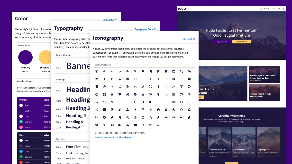
Natura11y's Figma UI Kit includes a collection of components, variables, and styles created with the same simplicity and ease-of-use as Natura11y's front-end framework. It doesn't give you everything, but includes the fundamentals so you can quickly iterate between design and development.
Key Features
The UI Kit includes the following features:
Local Variables
The kit's local variables align with Natura11y's CSS variables. This ensures that your design system and front-end framework are in sync at the start.
Modes = Theme Colors
The UI Kit includes Figma's modes that mirror Natura11y's dynamic color theming. No need for duplicative variants for color options. Keep your design system small and manageable, and apply color across components and pages with ease.
Design and Sync Icons
Natura11y's icon library is included in the UI Kit. This allows you to design and sync icons between Figma and the front-end. Why pay or subscribe to an icon library when you can create and manage your own for free?
A Guide to Managing Icons within Figma
Once you open the Figma UI Kit, you'll notice that the icons are organized into a component library (within the Guide page). This allows you to easily update icons across your design system. It also makes it possible to export icons as SVGs, which can be used to generate your own icon font.
In this way, you can manage your icons both within Figma and on the front-end. This ensures that your icons are consistent and maintainable across your design system.
Step 1: Design the icon
You can create the icon directly in Figma. With the existing Natura11y icons, the original vector layers have been preserved within each component.
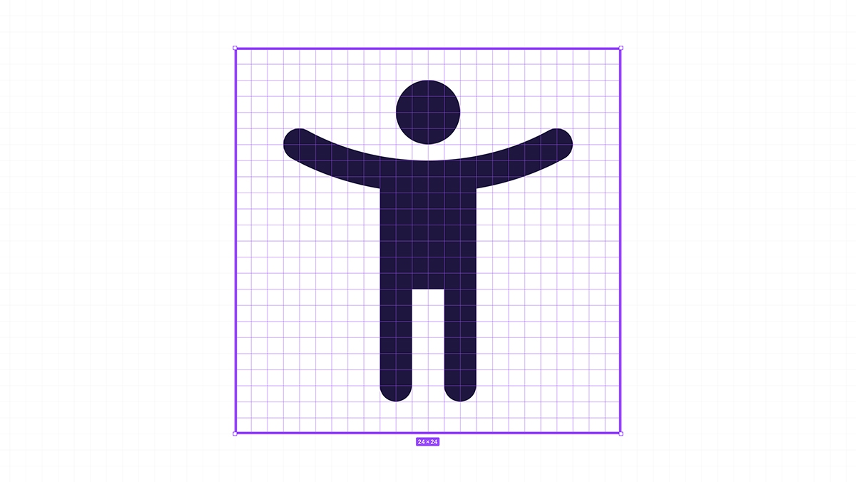
The final icon should fit within a 24x24 pixel square, with a pixel or two of breathing room around the edges.
Step 2: Create the icon component
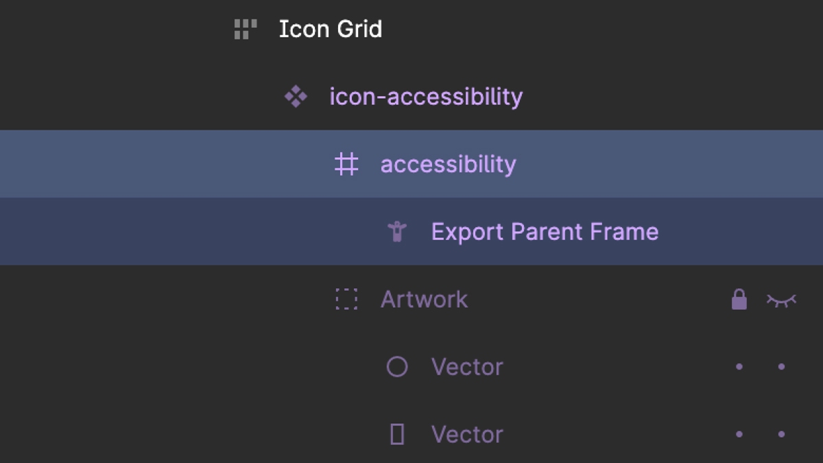
Once you've designed the icon, it's time to create the icon component. Each component has a frame which contains the flattened vector icon layer. The frame is sized to 24x24 pixels, and named according to the icon's handle (or suffix). In a later step, this frame exports an SVG from Figma. With the example below, the frame is named accessibility.
The icon component contains a group called Artwork. It holds the icon's original layered shapes. The Artwork group should be used as reference or for modifications, otherwise it should remain hidden within the icon component.
Step 3: Modify the fill rule
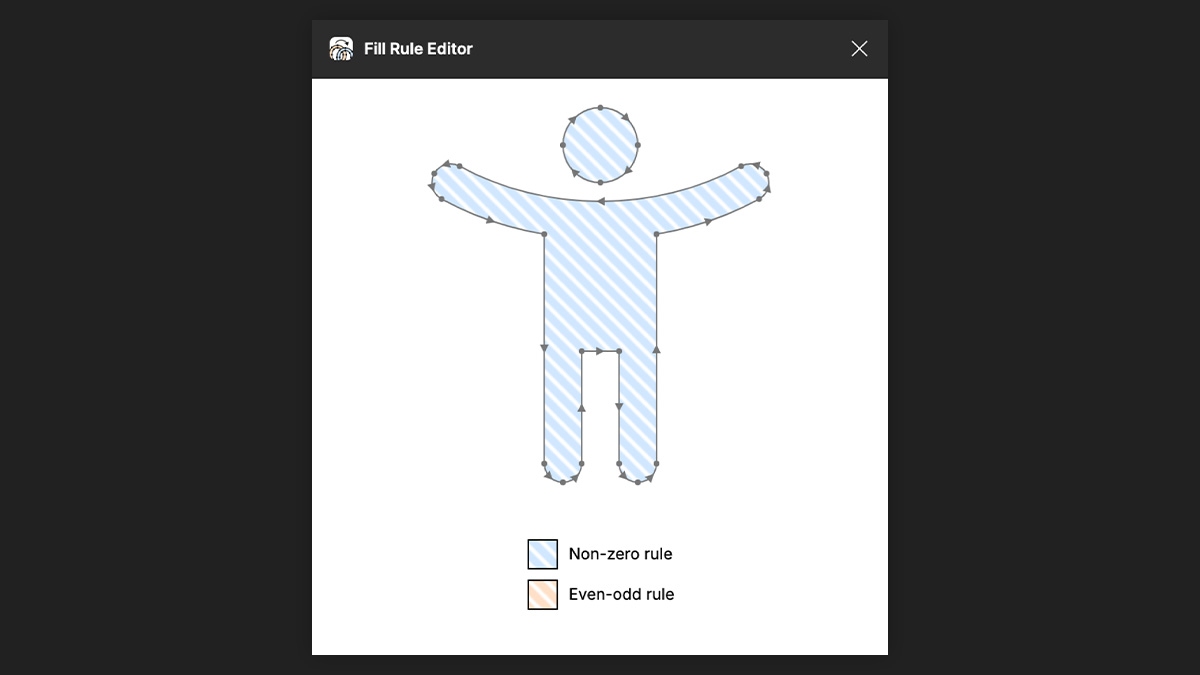
This step is only required for icons that contain a hole or multiple paths. For example, the accessibility icon contains two separate paths: one for the head, and one for the body. To ensure that the paths are maintained as expected when the icon is exported as an SVG, you must modify the fill rule from Even-Odd to Non-Zero.
Thankfully, Evan Wallace has made a Figma plugin called Fill Rule Editor that makes it easy to do this.
Step 4: Export the icon as an SVG
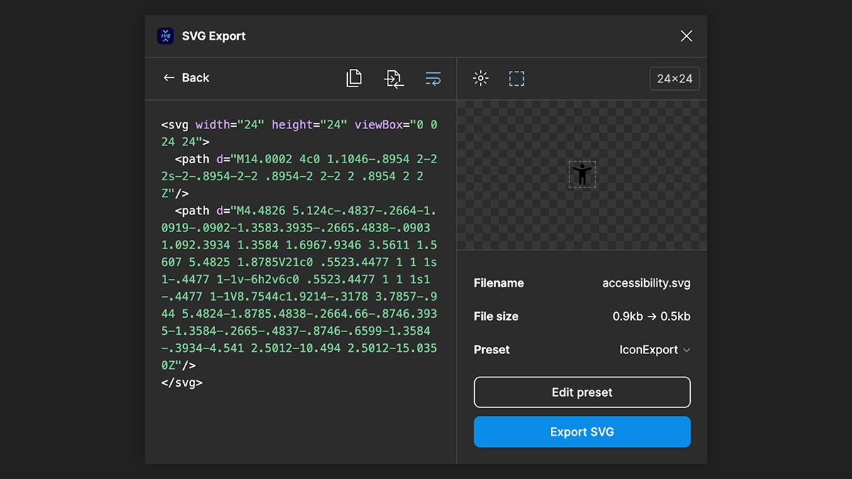
Now that the icon is ready, install the SVG Export plugin for Figma. This plugin, created by Hamish allows you to customize the export settings for each icon. Aim to remove any unnecessary attributes and keep the SVG as clean as possible. For example, you should remove any fill or stroke declarations. Ultimately, you want the export to only contain the parent SVG tag and paths that make up the icon.
The SVG Export plugin allows you to preview the code and visual icon before exporting. This helps to ensure the icon is clean and ready to use. Once you're satisfied with the SVG, export it to your local machine.
Step 5: Generate the icon font
The Natura11y Icons GitHub repo contains a folder called original-svg. This is where you should save the SVG file. It should be named according to the icon's handle (or suffix). With the example below, the SVG is named accessibility.svg.
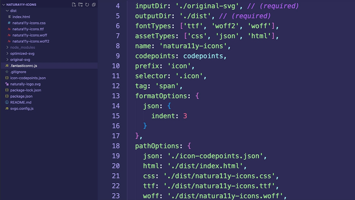
The README.md file in the natura11y-icons repository contains instructions on generating the icon font. Don't worry, it's easy! Now you can use your custom icon font within the Natura11y framework and maintain it directly in Figma.