Photo by Luca Micheli on Unsplash
Backdrops
Backdrops provide a useful design pattern—placing a translucent image behind contextual content. Backdrops offer two distinct style variants: Image proportional and fixed height.
Backdrops remove the need for CSS background images. Feature images exist within the HTML, so screen readers can read the text of the image's alt attribute.
Image Proportional
Image proportional backdrops scale and stack responsively. Below is an example of a basic image proportional backdrop.
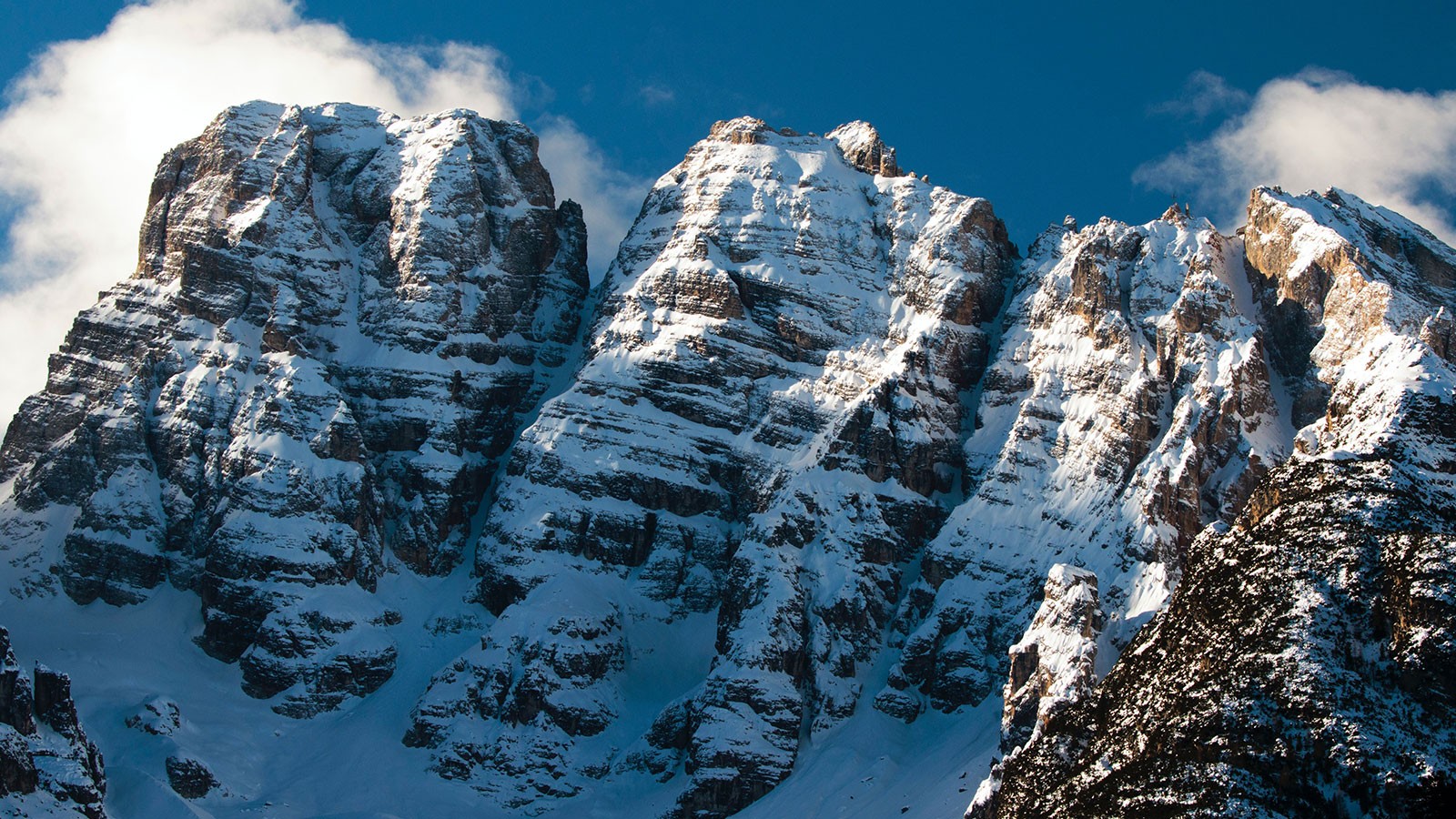
Photo by Zdeněk Macháček on Unsplash
In Their Eternal Faces
The Sun—with just delight
<div class="backdrop theme-dark border-radius">

    <div class="backdrop__image">

       <img class="opacity-50" src="https://via.placeholder.com/1500x750" alt="Placeholder" />

        <div class="backdrop__image__credit">
            <p>Photo by <a href="#1">Jane Doe</a> on Unsplash</p>
        </div>

    </div>

    <div class="backdrop__cover">

        <div class="container text-align-center">
            <p class="h4 text-shadow margin-bottom-3">
                <em>In Their Eternal Faces<br>The Sun—with just delight</em>
            </p>
            <a class="button font-size-md theme-primary" href="#1">
                Emily Dickenson Poetry
            </a>
        </div>

    </div>

</div>| Line # | Details |
|---|---|
| 1 | The parent The The |
| 3-11 | The It contains the feature image. The It is where you provide a credit for the image. |
| 13-24 | The It holds the backdrop's contextual content. |
The size of this backdrop (proportional width and height) is determined by the size of its feature image.
The translucent effect of the backdrop is acheived with the use of additional utility classes. Our theme color utilities (e.g. .theme-dark) provide the background and text color. The opacity utility class (e.g. .opacity-30) applied to the backdrop's feature image, allows the background color to show through.
Stack Breakpoint Modifiers
When using image size proportional backdrops for featured content (like the full-width example below) the backdrop may become too tall for the image on smaller viewport sizes.
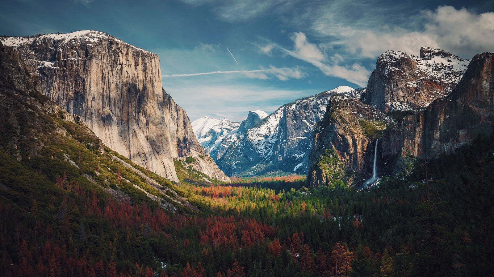
Photo by Aniket Deole on Unsplash
The mountain at a given distance In amber lies
—Excerpt from Delight becomes pictoral
To occomodate small viewports, include a stack breakpoint modifier (e.g. .backdrop--stack--{x}) to the .backdrop selector. Where x equals the desired breakpoint (e.g., lg for large). The backdrop's image is placed above the content vertically until the viewport reaches the desired breakpoint specified in the modifier.

Photo by Aniket Deole on Unsplash
The mountain at a given distance In amber lies
—Excerpt from Delight becomes pictoral
The above example shows how the same full-with backdrop appears on a smaller (mobile) viewport.
Notice, too, the image is at full opacity. That's because our opacity classes have their own a breakpoint modifiers. Adding .opacity-40--lg to the .backdrop__image selector gives that image a specified opacity (40%) at the large (lg) breakpoint.
Figure 2 (below) provides code used to create the backdrop above. Refer specifically to line 1, where the .backdrop--stack--lg breakpoint modifier is present.
<div class="backdrop backdrop--stack--lg theme-dark">


    <div class="backdrop__image">

        <img class="opacity-50" src="https://via.placeholder.com/1500x750" alt="Placeholder" />

        <div class="backdrop__image__credit">
            <p>
                Photo by <a href="#1">Jane Doe</a> on Unsplash
            </p>
        </div>

    </div>

    <div class="backdrop__cover">

        <div class="container narrow margin-y-5">

            <div class="text-shadow text-align-center margin-bottom-4">
                <h1 class="banner-headline">
                    The mountain at a given distance<br>
                    In amber lies
                </h1>
                <p>
                    —Excerpt from <em>Delight becomes pictoral</em>
                </p>
            </div>

            <div class="grid grid--column-2--md gap-2">

                <a class="button button--outline width-100" href="#1">
                    About Emily Dickenson
                </a>

                <a class="button theme-secondary width-100 box-shadow-1" href="#1">
                    Emily Dickenson Poetry
                </a>

            </div>

        </div>

    </div>

</div>All of this together makes it easy to create responsive backdrops with different flavors of color and content. What if we don't want our backdrop's size to be dictated by its feature image?
Fixed Height
Fixed height backdrops retain their height across viewport sizes. When needed, they adjust to the height of their inner content.
For a fixed height backdrop, append the .backdrop--fixed modifier to the .backdrop selector.

Photo by Jane Doe on Unsplash
The Mountain sat upon the Plain
Figure 3 gives us the HTML for the above example:
<div class="backdrop backdrop--fixed theme-dark">

    <div class="backdrop__image">
        <img class="opacity-50" src="https://via.placeholder.com/1500x750" alt="Placeholder" />

        <div class="backdrop__image__credit">
            <p>Photo by <a href="#1">Jane Doe</a> on Unsplash</p>
        </div>

    </div>

    <div class="backdrop__cover">

        <div class="container medium margin-y-4">
            <h1 class="banner-headline text-color-secondary text-shadow">
                The Mountain sat upon the Plain
            </h1>
        </div>

    </div>

</div>The .backdrop--fixed selector stretches to fit the content within .backdrop__cover. Consider the following layout:
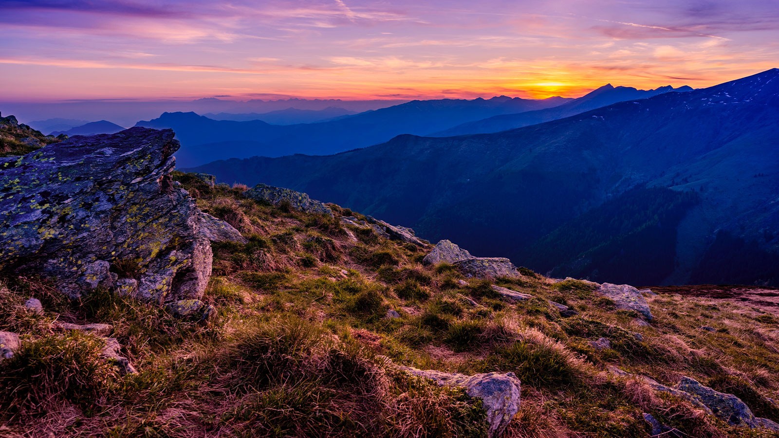
Photo by Jane Doe on Unsplash
Nature in Poetry
Featured Poem
This—is the land—the Sunset washes—
This—is the land—the Sunset washes—
These—are the Banks of the Yellow Sea—
Where it rose—or whither it rushes—
These—are the Western Mystery!
Night after Night
Her purple traffic
Strews the landing with Opal Bales—
Merchantmen—poise upon Horizons—
Dip—and vanish like Orioles!
<div class="backdrop backdrop--fixed theme-dark">

    <div class="backdrop__image">
        <img class="opacity-50" src="https://via.placeholder.com/1500x750" alt="Placeholder" />

        <div class="backdrop__image__credit">
            <p>Photo by <a href="#1">Jane Doe</a> on Unsplash</p>
        </div>

    </div>

    <div class="backdrop__cover">

        <div class="margin-y-5">

            <div class="container narrow">
                <h1 class="banner-headline text-align-center text-shadow margin-bottom-4">
                <em>Nature in Poetry</em>
                </h1>
            </div>

            <div class="container narrow medium--xl">

                <div class="grid grid--column-2--xl gap-2 justify-content-center">

                    <div class="card border-radius theme-light box-shadow-2">

                        <div class="card__head border-bottom">

                            <p>
                                <em>Featured Poem</em>
                            </p>
                        </div>

                        <div class="card__body">
                            <h2 class="h6">
                                This—is the land—the Sunset washes—
                            </h2>
                            <p>
                                <em>
                                    This—is the land—the Sunset washes—<br>
                                    These—are the Banks of the Yellow Sea—<br>
                                    Where it rose—or whither it rushes—<br>
                                    These—are the Western Mystery!
                                </em>
                            </p>
                            <p>
                                <em>
                                    Night after Night<br>
                                    Her purple traffic<br>
                                    Strews the landing with Opal Bales—<br>
                                    Merchantmen—poise upon Horizons—<br>
                                    Dip—and vanish like Orioles!
                                </em>
                            </p>
                        </div>

                        <div class="card__foot border-top">
                            <a class="button button--has-icon--disperse theme-primary" href="#1">
                                <span class="button__text">Emily Dickenson Poetry</span>
                                <span class="icon icon-arrow-right button__icon"></span>
                            </a>
                        </div>

                    </div>

                    <div class="card border-radius theme-light box-shadow-2">

                        <div class="card__head border-bottom">
                            <p>
                                <em>About the Poet</em>
                            </p>
                        </div>

                        <div class="card__body">
                            <h2 class="h4">
                                Emily Dickenson
                            </h2>
                            <p>
                                Emily Elizabeth Dickinson was an American poet. Little-known during her life, she has since been regarded as one of the most important figures in American poetry.
                            </p>
                            <p>
                                Dickinson was born in Amherst, Massachusetts into a prominent family with strong ties to its community.
                            </p>
                        </div>

                        <div class="card__foot border-top">
                            <a class="button button--has-icon--disperse theme-primary" href="#1">
                                <span class="button__text">About Emily Dickenson</span>
                                <span class="icon icon-arrow-right button__icon"></span>
                            </a>
                        </div>

                    </div>

                </div>

            </div>

        </div>

    </div>

</div>Related CSS Variables
Further customize Backdrops by redefining any of their related CSS variables as shown below.
.backdrop {
    --backdrop-fixed-height: 400px;
}